
Cascading Style Sheet (CSS)
Junghoo Cho
cho@cs.ucla.edu
CSS (Cascading Style Sheet)
- A set of rules for specifying document formatting and presentation
- Rule = Selector + Declaration block
- Selector: tag, class, ID, *, …
- Declaration block:
- Enclosed inside
{ } - List of “
property: value;” pairs
- Enclosed inside
CSS Example
p {                 /* p element */
    background-color: grey;
}
p.notes {           /* p element of notes class */
    background-color: yellow;
}
p .notes {          /* notes-class element that is a descendant of p */
    background-color: blue;
}
#text3372 {         /* id text3372 */
    background-color: green;
}
img[src$=".svg"] {  /* attr src ends with .svg */
    width: 20em;
}
Adding CSS Rules to Page
- CSS can be specified either
- directly inside
<style> ... </style> - in a separate file via
<link rel="stylesheet" href="example.css">
- directly inside
- Browsers has “default style values” for some tags
- To format a particular part, add
<div>or<span>tags if needed
Inheritance
- CSS can be specified in three places:
- Browser default
- User preference
- Web page
- If not set in any of the three places, an element inherits its parent’s CSS properties
Cascading Rule
- Cascading rule dictates which CSS rule wins in case of conflict
- Specificity: more “specific” rule wins!
- id > class > tag
- more detailed specificity rule: https://www.w3.org/TR/css3-selectors/#specificity
- Source order
- if equal specificity, later rule wins
- browser default < user preference < web page
- Specificity: more “specific” rule wins!
CSS Custom Properties
- “CSS variables”: Allows using a “logical name” to specify a value
- Example
body { --light-bg-color: white; /* all descendants of body */ --dark-bg-color: brown; /* inherits these properties */ } code { background-color: var(--light-bg-color); } p { background-color: var(--dark-bg-color); }- Custom property names must start with
-- - Custom property values can be referenced with
var(...)function var(--dark-bg-color, black): fallback values- Use
blackif custom property--dark-bg-coloris not defined
- Use
- Custom property names must start with
Page Layout via CSS
- CSS can be used to specify the layout of a page
- Example: http://www.nytimes.com
- Relevant CSS concepts and properties
- CSS box model
positionpropertyblockvsinlineelement
CSS Box Model
- Every HTML element creates a virtual “box” around it
- Its dimension can be specified using the above properties
- Demo with example
overflow Property
- Specifies how to handle text overflow
visible(default): show overflow texthidden: “clip” overflow textscroll: always show scrollbarauto: show scrollbar only if overflow
Positioning Element
top,right,bottom, andleftproperties specify the element locationpositionproperty specifies how to interpret the “location”relative: relative to is normal positionabsolute: relative to its nearest positioned ancestorfixed: relative to the “viewport” (viewable client area)static: default. element is unpositioned
- Demo with example
Overlapping Elements
z-index: specifies vertical location if elements overlap.- Higher z-index elements is placed on top of lower z-index elements.
Block vs Inline Elements
- What we have seen are
blockelements- Block elements create a separate independent “block”
- E.g.,
<div>,<ul>,<p>, …
- Inline elements are different
- They do not create a separate block, but flow with surrounding text
width,height,margin-top,margin-bottomproperties are ignored- E.g.,
<span>,<a>, …
- Demo with example
CSS Layout Example
Q: How can we create the following layout?
- Header stays at top
width: 100%height: 90px
- Menu stays on left
width: 100pxheightfills below header
- Content area fills rest
- show scroll bar if overflow
- Code together here
CSS Grid
- CSS grid makes it easy to place elements in a tabular arrangement
- A grid container (created by “
display: grid;” property) includes grid items - Grid dimension is specified using
grid-template-rowsandgrid-template-columnsproperties
- A grid container (created by “
CSS Grid Example
#container {
    display: grid;
    grid-template-rows: 2em 2em 2em;
        /* height of each row */
    grid-template-columns: 100pt 100pt;
        /* width of each column */
}
<div id="container">
    <div>Cell 1</div>
    <div>Cell 2</div>
    <div>Cell 3</div>
    <div>Cell 4</div>
    <div>Cell 5</div>
    <div>Cell 6</div>
</div>
Cell 1
Cell 2
Cell 3
Cell 4
Cell 5
Cell 6
CSS Grid Example: Spanning
#container {
    display: grid;
    grid-template-rows: 2em 2em 2em;
    grid-template-columns: 100pt 100pt 100pt;
}
#c1 {
    grid-column-start: 1;
    grid-column-end: 3; /* spans columns 1-2 */
    grid-row-start: span 2; /* spans 2 rows */
}
<div id="container">
    <div id="c1">Cell 1</div><div>Cell 2</div>
    <div>Cell 3</div><div>Cell 4</div>
    <div>Cell 5</div><div>Cell 6</div>
</div>
Cell 1
Cell 2
Cell 3
Cell 4
Cell 5
Cell 6
Fixed vs Fluid Layout
- Fixed layout
- Elements have fixed width
- Resizing the window does not change their sizes or arrangements
- Fluid layout
- Elements use “percentage” of page width
- Elements dynamically resize and rearrange to fit window width
Responsive Web Design (RWD)
- Web is accessed from a wide range of devices
- Phone, tablet, desktop, …
- Page design should dynamically adapt to screen size
- Responsive Web design example
- General Rules for RWD
- Do NOT force users to scroll horizontally (Why?)
- Do NOT use fixed-width elements (Why?)
- Do NOT force users to zoom in and out to read text (Why?)
- Use CSS media queries to apply different styling depending on the screen size
Viewport (1)
- In 2007, Web pages were designed for desktop
- Large screen size
- To display the entire page, iPhone used “fake” display width (~980px) after zooming out
viewportmeta tag- User’s visible area of a web page
- width: viewport width
- initial-scale: initial “zoom level”
- iPhone adopted large value as the default
viewportvalue
Viewport (2)
- But today, we design Web pages specifically for mobile devices
- Override the default setting with
viewportmeta tag<meta name="viewport" content="width=device-width, initial-scale=1">- Do not use the default viewport size and zoom level!
Before
 After
After
Media Queries
- Mechanism to apply custom CSS rules for specific devices
- Example
@media (max-width: 800px) { /* CSS rules */ } - Syntax:
@media condition { /* CSS rules */ }- Enclosed rules are applied only if
conditionis true conditioncan be a complex boolean condition
- Enclosed rules are applied only if
Media Query Conditions
- Media types
screen,print,speech, andall(default)
- Media features
orientation,min-width,max-width,min-height,max-height,resolution, …
- Boolean operators
,=OR,and=AND,not=NOT- Precedence:
not>and>,
Media Query Example
-
Q: When does the following rule apply?
@media screen, (orientation: landscape) {
    /* ... */
}
CSS Flexbox
- “Flexible box”
- New addition to CSS to enable flexible layout of elements
- Elements are dynamically resized or rearranged based on available space
Flex Container and Flex Item
- Flexbox consists of a flex container and flex items
- A flex container (created by “
display: flex;”) includes many flex items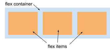
- All children of a flex container become flex items
- A flex container (created by “
Flexbox: Changing Size
- By default, flex items change its size to fit available space
- The exact resize behavior can be specified
flex-basis: default size of an elementflex-grow: when there is remaining space, extra space is divided among flex items according to their flex-grow factorflex-shrink: when there is space shortage, spaces are taken away from flex items by the factor of flex-shink * flex-basis
Flexbox: Rearranging Items
- Flex items in a container can be dynamically rearranged and stacked based on available space
flex-wrap: wrap
- Wrapping direction
- Horizontally: “
flex-direction: row;” or - Vertically: “
flex-direction: column;”
- Horizontally: “
Flexbox Example
-
In the earlier demo
#menu-container { display: flex; }
#nav   { flex: 1 1 200px; }
         /* flex-grow flex-shrink flex-basis */
#main  { flex: 2 1 400px; }
         /* Note flex-shrink 1! (not 2) */
#aside { flex: 1 1 200px; }

#large-box { display: flex; flex-wrap: wrap; }
Animation
- Q: How can we create animation effects on a page?
- e.g., scrolling news tickers, flying boxes, …
- Two approaches
- JavaScript
- CSS animation
JavaScript Animation
- Basic idea: Periodically update CSS property of an element
- Calling a function periodically
setInterval(callback, interval): invokecallbackeveryintervalmilliseconds
styleproperty: CSS properties of an element- Example:
body.style.background
- Example:
Animation Demo
- Ticker example
-
let loc = 0; let ticker = document.getElementById("ticker"); let timer = setInterval(tickerSlide, 100); function tickerSlide() { loc += 10; ticker.style.left = String(loc) + "px"; if (loc > 300) clearInterval(timer); } - Q: Why does the text move?
- Q: Why does it stop moving?
Animation: Another Example
<body>
    <div id="box" style="border: solid 5px black;"></div>
</body>
<script type="text/javascript">
let box  = document.getElementById("box");
let size = 0;
let timer = setInterval(callback, 100);

function callback() {
    box.style.width = String(size) + "px";
    box.style.height = String(size) + "px";
    size = (size + 10) % 200;
}
</script>
Relevant API
setInterval(callback, interval, param1, ...)- Invoke
callback(param1, ...)repeatedly everyintervalmilliseconds
- Invoke
setTimeout(callback, interval, param1, ...)- Invoke
callback(param1, ...)once afterintervalmilliseconds
- Invoke
clearTimeout(timer)orclearInterval(timer)- Clear existing
timer timer: return value fromsetTimeout()orsetInterval()
- Clear existing
CSS Animation
- Two possibilities
- Simple:
transitionproperty - Complex:
@keyframesrule
- Simple:
CSS transition property
- Creates “transition effect” when an element’s CSS changes
- Makes the changes “gradual”
- Example:
transition: height 1s;- When the element’s height changes, “animate” the change over 1s
CSS transition Example
- Example
- Code
<style>
    div {
        height: 1em;
        transition: height 1s;
    }
    div:hover {
        height: 10em;
    }
</style>
<body><div>CSS Transition</div></body>
CSS @keyframes Rule
@keyframesallows specifying the “keyframes” in animation@keyframes css3animation { 0% { background: red; } 50% { background: yellow; } 100% { background: green; } }- Update background property gradually using provided keyframes
- Apply a
@keyframerule withanimationproperty#header1 { animation: css3animation 3s; }- Apply
css3animationkeyframe rule to#header1over 3 seconds
- Apply
- Demo
Relevant CSS Properties
animation-delay- When the animation will start
animation-play-state: paused|running- Whether the animation is running or paused
animation-iteration-count- # of times animation is played (or
infinite)
- # of times animation is played (or
- Complex shape transformation:
transform- e.g.,
transform: rotate(45deg) scale(1.5);
- e.g.,
CSS Preprocessor
- Creating CSS rules manually for every element or class is repetitive
- “CSS preprocessors” generate CSS rules from a higher-level specification
- e.g., SASS, LESS, Stylus, …
CSS Frameworks
- Creating all UI elements with basic HTML and CSS from scratch is hard
- Many CSS “libraries” and “frameworks” exist that help creating interactive and responsive user interfaces
- Bootstrap: JavaScript + CSS UI framework
- Bulma
What We Learned
- CSS custom property
- Page layout via CSS
- CSS box model
position- CSS grid
- Responsive Web Design (RWD)
- fixed vs fluid layout
viewport, media query- CSS flexbox
- JavaScript animation:
setTimeout() - CSS transition and animation